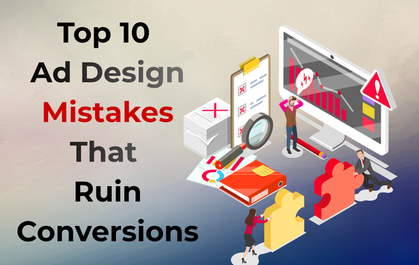
Top 10 Ad Design Mistakes That Ruin Conversions A Practical Guide by AD SMART INDIA
In digital advertising, design is not just about looking good — it directly impacts conversions, click-through rates, and return on investment. Many businesses spend heavily on ads but fail to see results because of common ad design mistakes that silently kill performance.
At AD SMART INDIA, we have analyzed hundreds of ad campaigns across Google, Facebook, and Instagram. One pattern is clear: poor ad design is one of the biggest reasons ads fail, even with perfect targeting and budgets.
In this blog, we break down the top 10 ad design mistakes that ruin conversions and explain how to fix them.
1. No Clear Call-To-Action (CTA)
One of the most damaging mistakes is not telling users what to do next. An ad without a clear CTA leaves users confused, reducing clicks and conversions.
Why it hurts conversions:
Users don’t take action unless guided
Confusion increases bounce rate
Engagement drops significantly
How to fix it:
Use strong, direct CTAs such as:
Buy Now
Get a Free Quote
Sign Up Today
Book a Consultation
Your CTA should stand out visually and emotionally.
2. Overcrowded Ad Design
Trying to include too much information in a single ad is a common mistake. When ads look cluttered, users scroll past them instantly.
Why it hurts conversions:
Hard to read on mobile devices
Key message gets lost
Increases cognitive load
How to fix it:
Focus on one core message
Use minimal text
Keep enough white space
Highlight only one offer or benefit
Simple designs often outperform complex ones.
3. Poor Visual Quality
Low-resolution images, stretched graphics, or unprofessional visuals damage brand credibility.
Why it hurts conversions:
Reduces trust instantly
Makes your brand look unreliable
Lowers engagement rates
How to fix it:
Use high-resolution images
Follow platform-recommended dimensions
Avoid pixelated or stock-heavy visuals
Maintain consistent branding
Professional visuals communicate professionalism and trust.
4. Ignoring Mobile Optimization
Most users see ads on mobile devices. Ads designed only for desktop screens fail to perform on mobile.
Why it hurts conversions:
Text becomes unreadable
Buttons are hard to tap
Visual hierarchy breaks
How to fix it:
Design ads mobile-first
Use large fonts
Keep text short and readable
Test ads on real mobile screens
Mobile-friendly ads convert significantly better.
5. Weak or Confusing Headlines
Your headline is the first thing users read. A weak headline kills interest instantly.
Why it hurts conversions:
Users scroll without noticing
Value proposition is unclear
Emotional hook is missing
How to fix it:
Create headlines that:
Address a problem
Offer a solution
Highlight a benefit
Create urgency
Example: “Get 5x More Leads Without Increasing Ad Spend”
6. Mismatch Between Ad and Landing Page
When your ad promises something and the landing page shows something else, users lose trust and leave.
Why it hurts conversions:
High bounce rate
Broken user experience
Reduced Quality Score in Google Ads
How to fix it:
Match ad visuals with landing page visuals
Repeat the same headline and offer
Keep consistent messaging
Consistency builds trust and increases conversion rates.
7. Using Too Much Text on Images
Many advertisers overload images with text, especially on social media ads.
Why it hurts conversions:
Ads look spammy
Reduced reach on platforms
Poor readability
How to fix it:
Let visuals speak
Keep image text minimal
Use captions for explanation
Focus image text on one key message
Clean visuals perform better across all platforms.
8. Not Highlighting the Unique Selling Proposition (USP)
If your ad does not explain why users should choose you over competitors, conversions suffer.
Why it hurts conversions:
No differentiation
Users see you as just another option
Price competition increases
How to fix it:
Highlight what makes you different:
Free consultation
Same-day delivery
10+ years experience
Guaranteed results
Your USP should be instantly visible in the ad.
9. Poor Color Contrast and Font Choice
Bad color combinations and hard-to-read fonts make ads uncomfortable to view.
Why it hurts conversions:
Reduces readability
Causes visual strain
Looks unprofessional
How to fix it:
Use high-contrast colors
Stick to 1–2 fonts
Avoid fancy or script fonts
Ensure CTA buttons stand out clearly
Good design guides the viewer’s eyes naturally.
10. Not A/B Testing Ad Designs
Relying on one ad design without testing is a major growth blocker.
Ad design plays a critical role in conversion success. Even with perfect targeting and budget, bad design can ruin results. By avoiding these common ad design mistakes, businesses can significantly improve engagement, clicks, and conversions.
At AD SMART INDIA, we focus on performance-driven ad design that combines creativity with strategy. Whether you’re running Google Ads, Facebook Ads, or Instagram Ads, fixing these design mistakes can instantly boost your campaign results.
If you want ads that don’t just look good but actually convert, start by optimizing your ad design today.